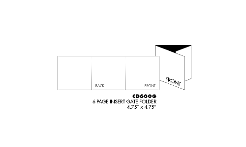
For the second part of the coursework we're asked to design a digipak which consists of a single cover and a magazine poster promoting the music video. The designs need to be related to the music video and the band that has performed it too. The first thing I'm going to design is the logo for the band by designing multiple logos and choosing the best one for the album cover.
Research
Some band's artwork involves photographs from the singles and here are some examples:
Research
Some band's artwork involves photographs from the singles and here are some examples:
THE LOGO
One of the most used text creators is FlamingText.co.uk which offer a lot of text templates to create logos:
Here are several designs for the band name that I created using the website (the one I chose is bigger than the others):
I also created the title of the song using the same text styles:
I chose the metal one because I felt that it was the most like the band's genre so it attracts appropriate audiences that like that type of music. Also, compared to the bands actual logo which is very basic, it is still simple but it's also effective because it represents the right genre.
(ORIGINAL)
(MINE)
These are some of the photos of the band that we took when we were filming. Usually, on rock band CDs, the band almost always feature on the front of the cover. I've chosen the last photo as it looks the best, I'll then edit it and place it on the cover.
This is how I'm going to have my single CD laid out.
These are some photos that I wanted to include as the inside of the cover because it relates to the song and the album cover needs to relate to the music video. To make sure it's appropriate to fit on the CD cover I've decided to stretch it out to see if it's still effective.
I also created the title of the song using the same text styles:
I chose the metal one because I felt that it was the most like the band's genre so it attracts appropriate audiences that like that type of music. Also, compared to the bands actual logo which is very basic, it is still simple but it's also effective because it represents the right genre.
(ORIGINAL)
(MINE)
THE BAND
These are some of the photos of the band that we took when we were filming. Usually, on rock band CDs, the band almost always feature on the front of the cover. I've chosen the last photo as it looks the best, I'll then edit it and place it on the cover.
This is how I'm going to have my single CD laid out.
These are some photos that I wanted to include as the inside of the cover because it relates to the song and the album cover needs to relate to the music video. To make sure it's appropriate to fit on the CD cover I've decided to stretch it out to see if it's still effective.


No comments:
Post a Comment