I looked at some of the posters that advertise singles for bands that are similar to the genre of Issues. These were what I found. As I didn't have time to draw my own magazine advert like a lot of rock bands have done recently, I decided that this isn't what I could do.
Welcome
Tuesday, 28 January 2014
Tuesday, 21 January 2014
Diary Entry #27: Construction - Album artwork draft
These are the images I used:
This is what I've come up with so far for my music video. I decided to make it look like an actual CD rather than a 3 panel fold out because the inside photo would have been too stretched out. Here is the photo on the inside:

Later on I changed my mind about the panelling because I felt it would look better with 3 panels.
Thursday, 2 January 2014
Diary Entry #26: Construction - Digipak Research 2
For the second part of the coursework we're asked to design a digipak which consists of a single cover and a magazine poster promoting the music video. The designs need to be related to the music video and the band that has performed it too. The first thing I'm going to design is the logo for the band by designing multiple logos and choosing the best one for the album cover.
Research
Some band's artwork involves photographs from the singles and here are some examples:
Research
Some band's artwork involves photographs from the singles and here are some examples:
THE LOGO
One of the most used text creators is FlamingText.co.uk which offer a lot of text templates to create logos:
Here are several designs for the band name that I created using the website (the one I chose is bigger than the others):
I also created the title of the song using the same text styles:
I chose the metal one because I felt that it was the most like the band's genre so it attracts appropriate audiences that like that type of music. Also, compared to the bands actual logo which is very basic, it is still simple but it's also effective because it represents the right genre.
(ORIGINAL)
(MINE)
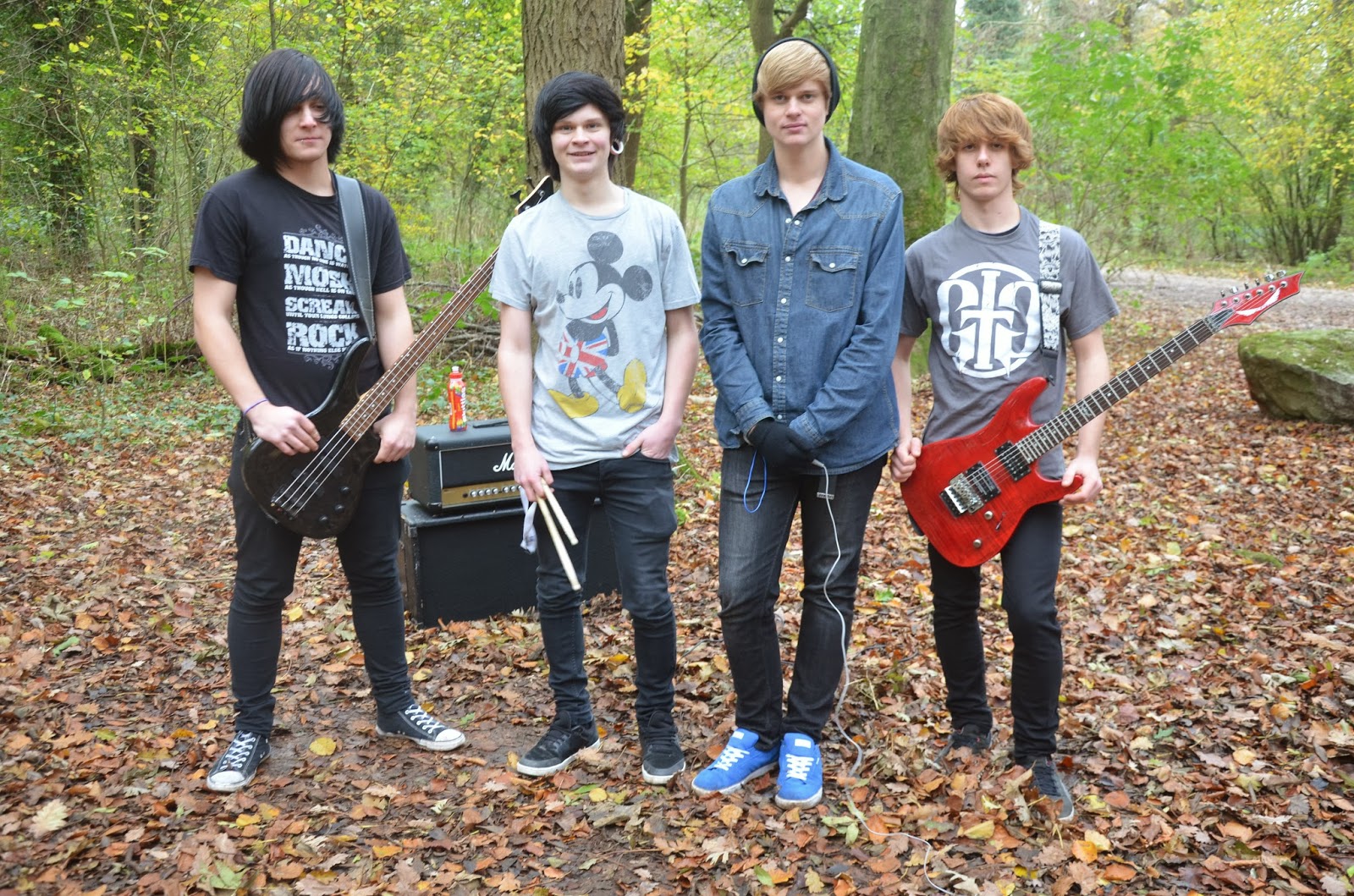
These are some of the photos of the band that we took when we were filming. Usually, on rock band CDs, the band almost always feature on the front of the cover. I've chosen the last photo as it looks the best, I'll then edit it and place it on the cover.
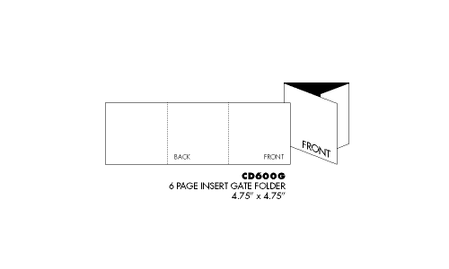
This is how I'm going to have my single CD laid out.
These are some photos that I wanted to include as the inside of the cover because it relates to the song and the album cover needs to relate to the music video. To make sure it's appropriate to fit on the CD cover I've decided to stretch it out to see if it's still effective.
I also created the title of the song using the same text styles:
I chose the metal one because I felt that it was the most like the band's genre so it attracts appropriate audiences that like that type of music. Also, compared to the bands actual logo which is very basic, it is still simple but it's also effective because it represents the right genre.
(ORIGINAL)
(MINE)
THE BAND
These are some of the photos of the band that we took when we were filming. Usually, on rock band CDs, the band almost always feature on the front of the cover. I've chosen the last photo as it looks the best, I'll then edit it and place it on the cover.
This is how I'm going to have my single CD laid out.
These are some photos that I wanted to include as the inside of the cover because it relates to the song and the album cover needs to relate to the music video. To make sure it's appropriate to fit on the CD cover I've decided to stretch it out to see if it's still effective.
Thursday, 12 December 2013
Tuesday, 10 December 2013
Diary Entry #23: Bloopers
I decided to make a bloopers reel of all the clips when we were filming our music video (both band and narrative):
Diary Entry #22: Editing 4
Today I finished my rough cut for my music video. Because I only had about 30 seconds left it didn't take me long to finish editing. Even though there are some flaws in the music video like the lip syncing not being completely spot on and I'm not completely happy with the different effects but when the audience feedback comes back I will change some of the things I did:
The Luma Keyer effect that I used for the band was the best I could do, as I wanted to darken down the band as it looked too 'light' and usually the conventions of the rock genre involve dark lighting. Due to the fact we couldn't use the building that we wanted to use, this was a factor that would have to be overcome when it came to editing as when we filmed it it was early in the morning. For my final cut, I will edit the effect so I am fully satisfied with the outcome and I can finish the video.
This is the effect I used for the narrative part of the music video. Because the song was actually supposed to be a dream, I decided that the best effect I could use was a dream effect. It is purely that effect as I feel if I messed around with the effect too much it would ruin the music video and the effect that it gives when the audience watch it.
Subscribe to:
Posts (Atom)