In what ways does your media product use, develop or challenge forms and conventions of real media texts?
My genre of choice for my music video is rock/hard
rock. This was the best genre choice for me because that is the genre I’m into
and the genre that I know most about. When planning the music video I had to
look at the conventions of a rock music video. Things I discovered about a rock
music video is that it usually includes the band and a form of narrative,
although sometimes it can just have a band performance like a live performance:
Another convention of rock music video is the narrative, if included, usually represent something meaningful e.g. relationships with a partner/family, inner demons and a personal problems. An example of this would be
.
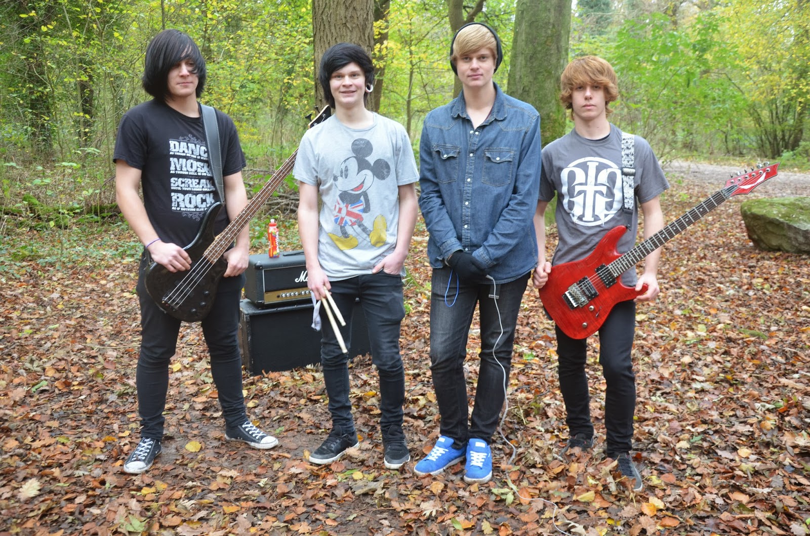
Other conventions usually include dark misc-en-scene e.g. dark lighting, costume and band performances in quite deserted areas like a woods or a derelict building
,
more specifically a warehouse. The appearance of the band is also important to allow the audience to identify with them. A lot of hard rock/metal bands have tattoos like Oli Sykes in
My music video has used all of these usual conventions
of a rock genre. If I challenged the music conventions it would confuse people
as to what genre the video would be about. An example of a music video that
challenges the conventions of a rock music video would be
).
Another example of a challenging of conventions is
.
An example of a music video without a narrative is
.
My music video keeps all the key conventions as the song is quite dark. I included: dark lighting, a deserted area, dark misc-en-scene, a band performance and a narrative. I could not include tattoos because none of the band have any.
The form of my media piece is music video. With music
video you aren’t limited to linear editing. Carol Vernallis’ theory supports
this. She said editing in traditional fiction was more frequent in music video
including things like wipes and transitions and especially jump cuts, making
the narrative quick and short. I decided to keep the form of my music video to
allow me to develop my own music video to attract the correct audience. An
example of moving images in time with the music is my video.
In conclusion my music video had used all the forms
and conventions and not challenged them at all to keep originality but also
with an element of structure.


